Did you know that we are going through a "second" wave of minimalist shields in football? Yes, for a time, the vast majority of teams adopted minimalism to represent their identity.
However, the reason minimalism is making a comeback now is completely different. We will understand the reasons for this in the article below.
The 1st minimalist era
The first minimalist era of shields was not something that happened immediately and in every club in the world at the same time. In fact, it was a very long process, which began in the late 70s and lasted until more or less the 90s.
It is important to highlight that several clubs had longer minimalist periods, while others chose to maintain them for a shorter time, each for different reasons.
However, the main reason why clubs adopted minimalist crests was the same: to make the club easier to recognize on TV broadcasts and on players' shirts.
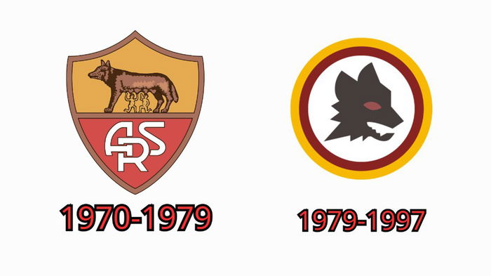
One of the clearest examples of this change was Rome, which changed its shield in 1979, representing only the Wolf's head.
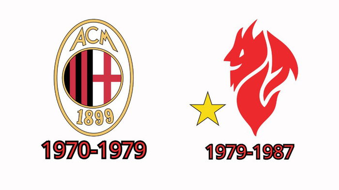
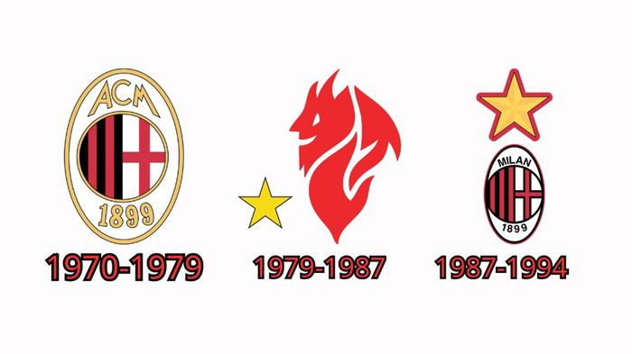
Another Italian club that went through the same process in the same year was Milan, which adopted the face of the famous "little devil", the club's mascot.
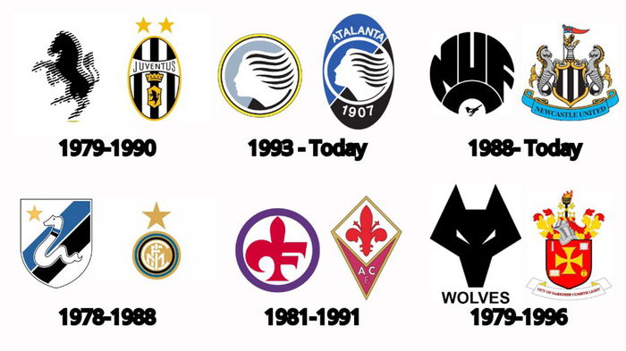
Below are other examples of clubs that adopted more minimalist crests in the same period:
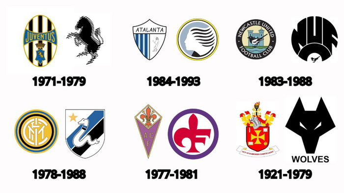
Due to the low quality of televisions at the time and the need to print logos in a simplified way, this style of shield became extremely common and was widely used throughout the world until the arrival of the 90s.
The End of the 1st minimalist era
In the 1990s, with the advent of the internet, increased video quality and improvements in information technology, football logos were able to return to more complex forms. Now it was possible to print, view and reproduce them with ease.
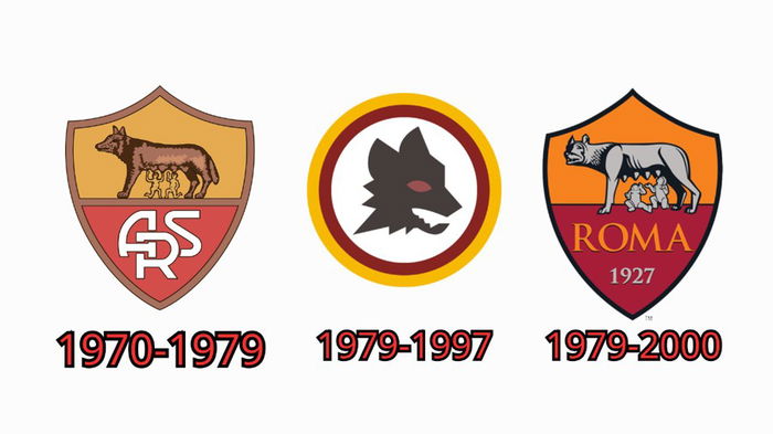
Roma, for example, returned to its old logo, but with some changes.
Milan followed the same path:
Other clubs also returned to their more complex origins during this period:
The 2nd minimalist era
We are currently experiencing the beginning of a second minimalist era. However, the reasons are completely different from the first. Today, it is possible to reproduce any image in high resolution and watch videos in 8K, meaning "seeing" the logo is no longer a problem. But then, why the change?
The answer is complex, as each club has a specific reason.
Juventus, for example, abandoned the traditional Italian oval style and adopted a minimalist design with the club's stylized initials. The stated aim was to "modernize the club".
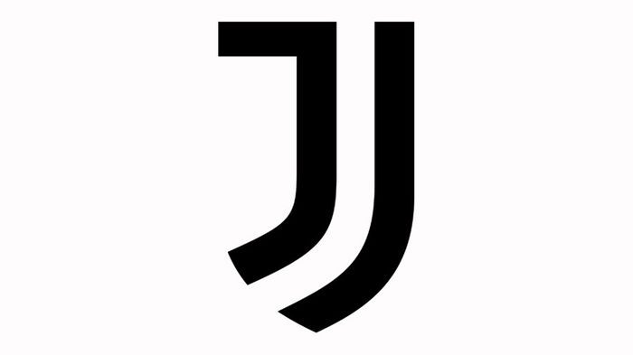
This modernization generated great revolt among fans, but increased the club's international representation. However, the question remains: was it the new logo or the fact that the club signed Cristiano Ronaldo at the same time that boosted this visibility?
In fact, the new shield has become more modern. However, classic elements, such as the zebra and stripes, were eliminated, which left a feeling of "loss" for many.
This change was not designed for current fans, but for new generations, who will grow up accustomed to the current symbol.
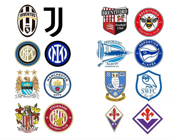
See below some examples of clubs that have simplified their badges in this new minimalist era:

One of the reasons speculated for this new "wave" is that, currently, with social networks, there is a lot of visual pollution on screens. Complex shields do not match the clean design of websites and digital platforms. Therefore, a simpler symbol fits better in places like profile photos, website headers and icons.
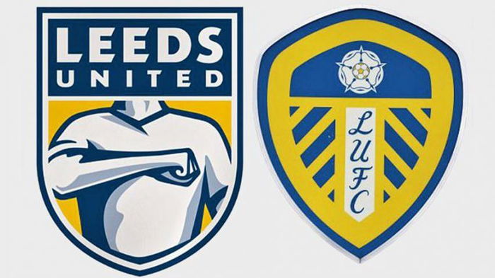
So far, the overwhelming majority of these changes have generated outrage among fans. For example, Leeds, in 2018, tried to change their crest, but the fans hated it so much that the new option wasn't even made official.
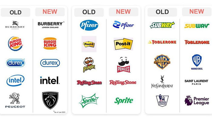
This doesn't just happen in football, but it's a global trend among companies.
It is still too early to say whether these changes are beneficial or not. It may be that, in the future, clubs will again adopt some type of change or “trend”, and minimalism will cease to exist, as has happened in the past.
What is your opinion on minimalism in football badges? Leave it in the comments!
Conclusion
If you've read this far, thank you very much! I hope you had fun and enjoyed the content.
Don't forget to share this article on social media. Until next time!







— 评论 0
, 反应 1
成为第一个发表评论的人